Uber Rider Safety Toolkit
Role
Lead Product Designer
Team
Myself, Product Manager, User Researcher, Design collaborators on multiple teams.
Time frame
6 months (20% time)
summary
Safety was Uber’s top priority in 2018 and 2019. As we were rapidly launching new safety features, I identified the opportunity to redesign the rider safety toolkit to future-proof and scale additional features. I created a framework for scaling the toolkit and worked across our entire suite of safety features to ensure it solves for our use cases. Without this project, the safety toolkit would have become a poor user experience without a strong stance on what it is and used for.
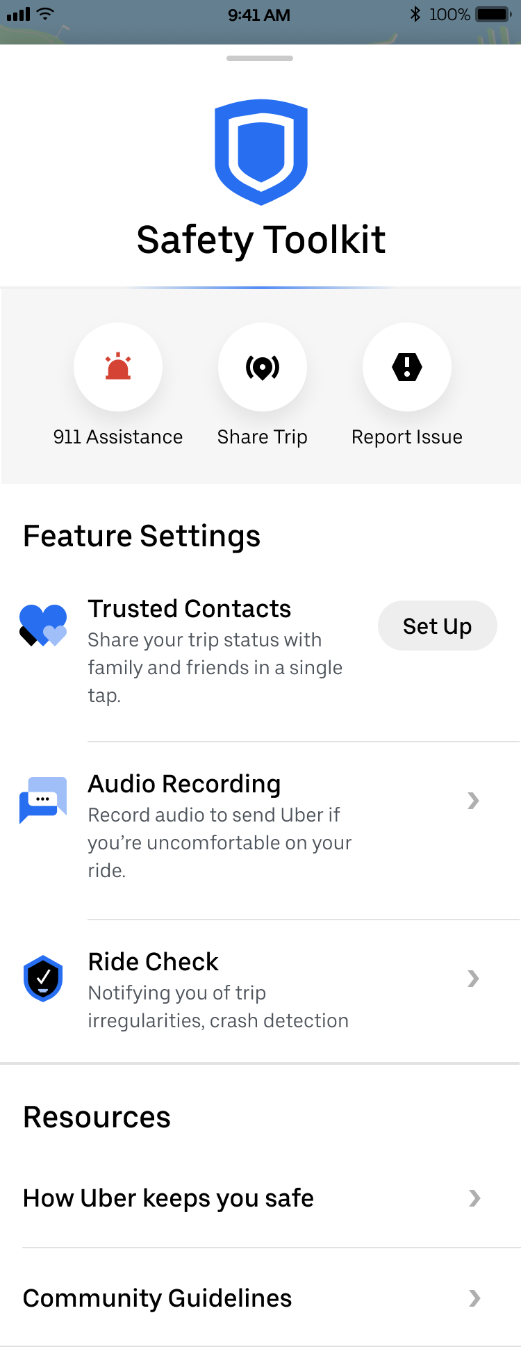
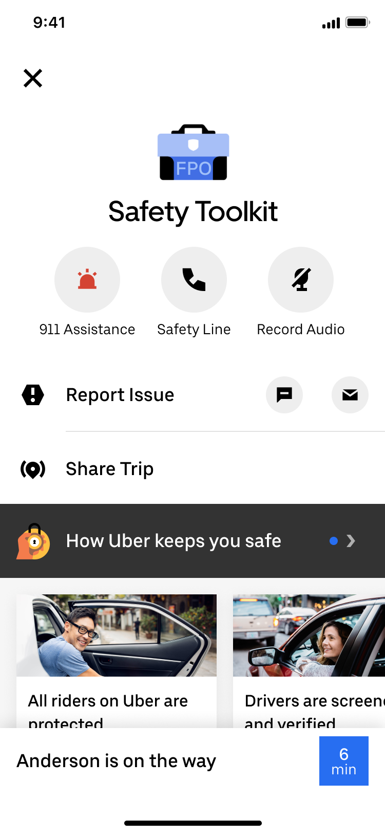
Before: original safety toolkit.
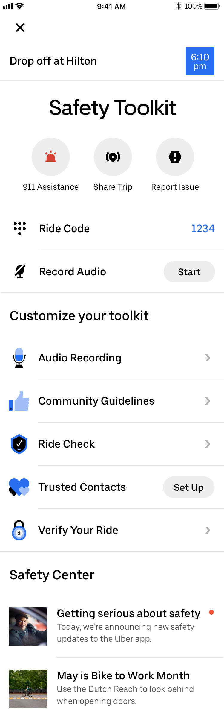
After: safety toolkit with features planned through 2019.
Challenges
This was a design-led project that was not on the PM roadmap, so I made the case for this to become a real project.
Creating a framework that takes into consideration current and future features.
Moving between a high-level view of the whole system and ensuring different features, states, use cases, and regions worked together.
METRICS
% of incident reports from users who have not opened the toolkit, safety feature awareness and sentiment
Background
In March of 2018, Uber launched a suite of 3 new safety features for the Rider app within a Safety Toolkit that riders could access during a trip. The goal was to educate the user on how Uber keeps them safe and be able to quickly access safety features. Over time, I noticed that the Safety Toolkit would not scale to include all the other features the product team had planned for 2019. If we continued adding new features into a new row, the toolkit would quickly run out of space, increasing the cognitive overload for a user who might be in a stressful or unsafe situation.
In addition, there were a host of other problems with the toolkit. It was using visual styles from an outdated design system, the information hierarchy wasn’t intuitive for users, individual features within the toolkit were not visually cohesive, and awareness of the toolkit was very low.
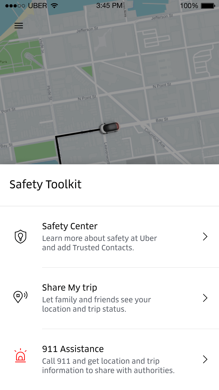
Original safety toolkit in Q1 2018
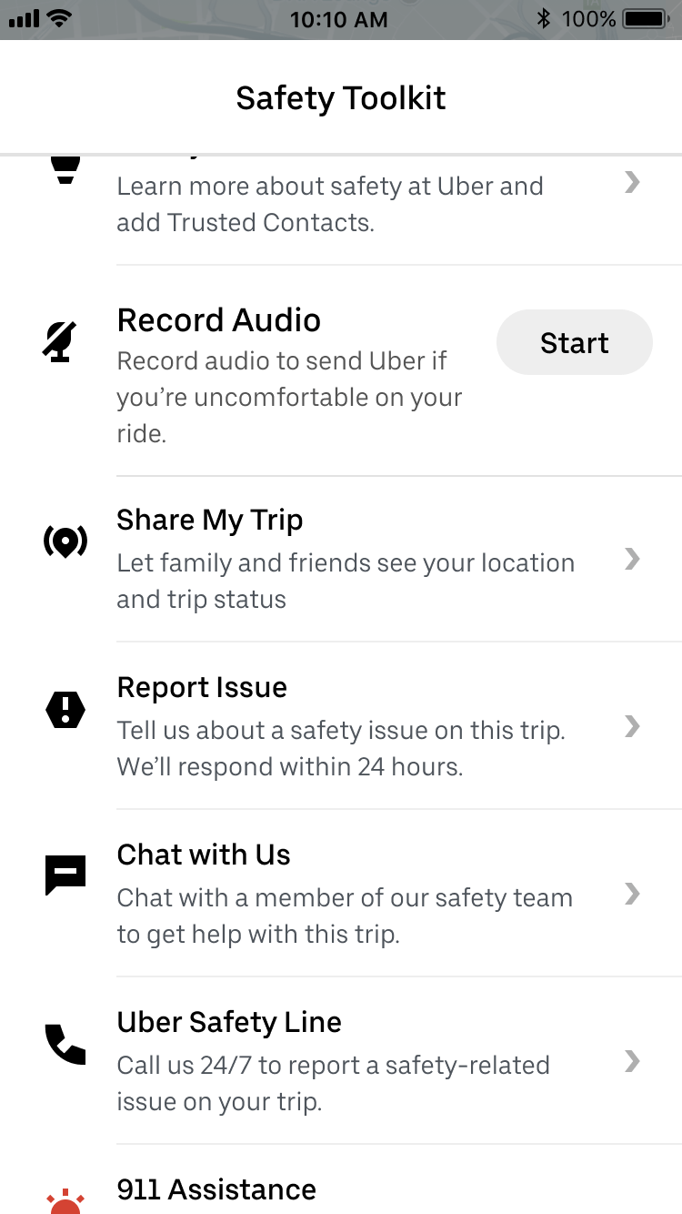
Safety toolkit with planned features for 2019 (with new components)
Design principles
I started by identifying some design principles for the project based on how we wanted the safety toolkit to work and what we wanted it to be.

Customize for context and region
Provide clear and principled guidance on how to use the framework so that others can customize for their region or product internally.

Provide a holistic safety experience
Users can accomplish all of their safety goals efficiently, whether it’s to learn more about how Uber protects them, all the way to de-escalating an emergency and the follow-up.

Give right support at the right moment
Highlight contextual actions at the right time to provide relevant actions in high urgency moments.

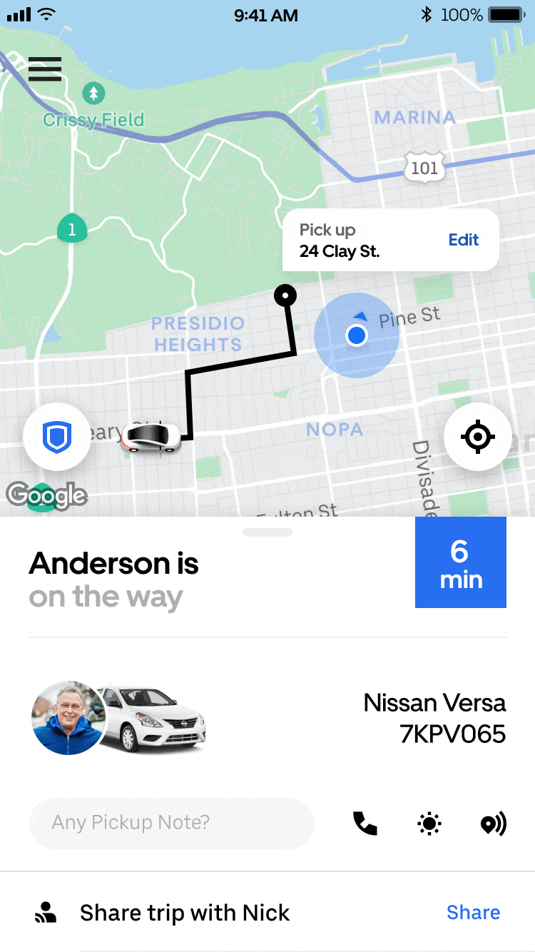
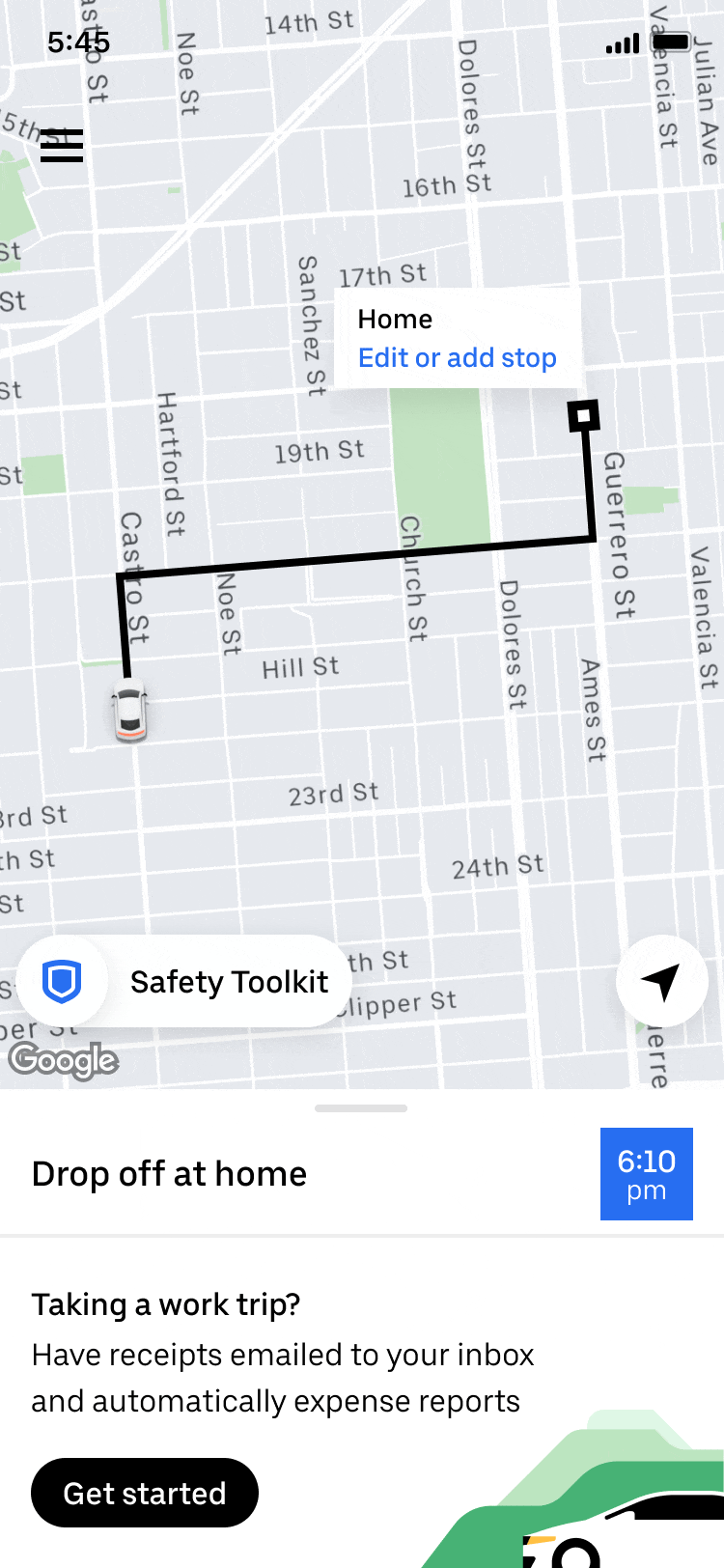
Keep the trip context
Always allow the user to return to their trip details easily and quickly.
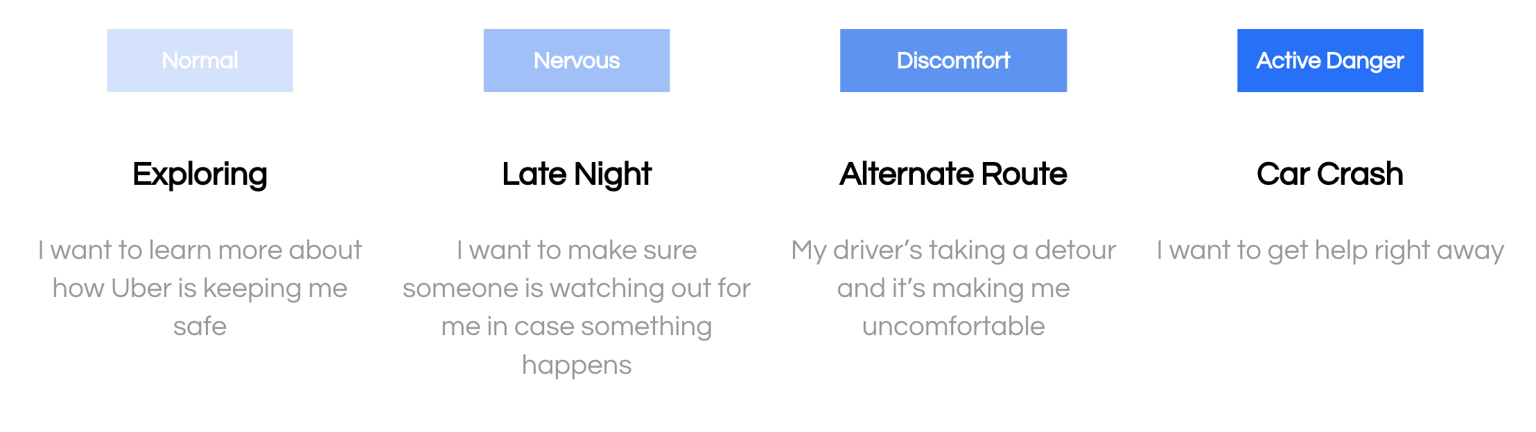
use cases
My PM and I also mapped out common safety use cases and user needs within these moments. We grouped these use cases into four groups with similar needs to inform the redesign of the safety toolkit.
Framework
Next, I did an audit of the safety toolkit and its planned features to create an information hierarchy that made sense, as well as mapped out the various components of the framework into the following: entrypoint, main toolkit, features, feature settings, and ride check (the toolkit’s urgent state when it detects something off about your trip).
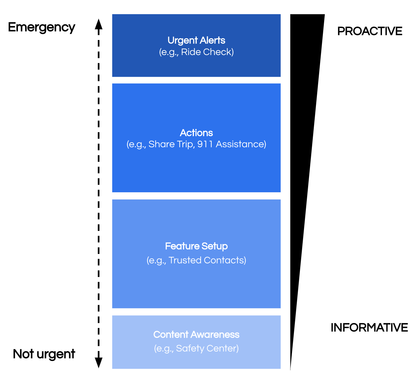
Information hierarchy for the new toolkit as it scales.
Explore & Iterate
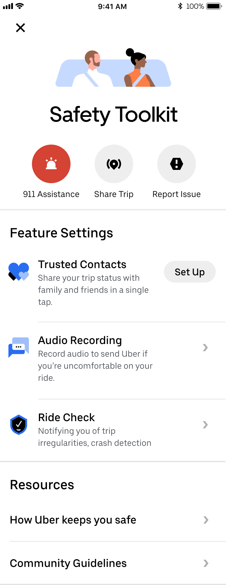
During the exploration and iteration phases, I worked closely with a member of the rider team to make sure we were keeping the context of the trip easily visible and accessible within the toolkit, as well as members of the design platform (system) team to make sure all the components were being used as intended. I also worked with a staff designer for feedback and ideation to ensure I’ve left no stone unturned. While I did start with wireframes, I quickly jumped into visuals since it was easier to envision how the screen would look like with existing components. Below are a few of the early iterations of the main toolkit screen.
Some of the design questions that came up were:
How does the toolkit open from the entrypoint? Is it a bottom sheet, action sheet, or a full page?
Where do we show the trip context in the toolkit?
How are actions differentiated across buttons and list items? How are stateful actions represented vs. toggles?
What’s the interaction pattern when a user triggers an action?
How are feature settings differentiated from features? How do we encourage users to set up new features?
How central does the Safety Toolkit need to be in terms of accessing all the safety features and functionality? Should we be directing users to the safety toolkit to change their settings or should they be accessing the app’s settings screen?
How can we reduce the text while still providing enough useful information to inform and encourage the sign-up of new features?
How does the safety toolkit change depending on the state of the trip you’re on? Should it be accessible offline? (This became prioritized as a separate project).
What is the Safety Center evolving into, and how can we increase awareness of safety features? (This was also prioritized as a separate project based on some of my explorations).
During one of our brainstorm sessions, the staff designer came up with an idea to bundle safety features into a “safe mode” that users could toggle on all at once, so I explored that concept further. After about 50+ iterations, I landed on the following two divergent options, one without “safe mode” and one with “safe mode”.
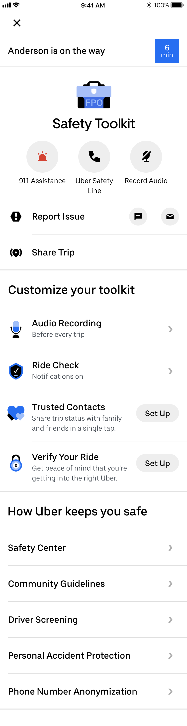
Version 1. Without Safe Mode
This safety toolkit is composed of actions, customizations, and informative articles. The user can see all the safety features that Uber offers in a glance, with quick access to the actions in emergencies.
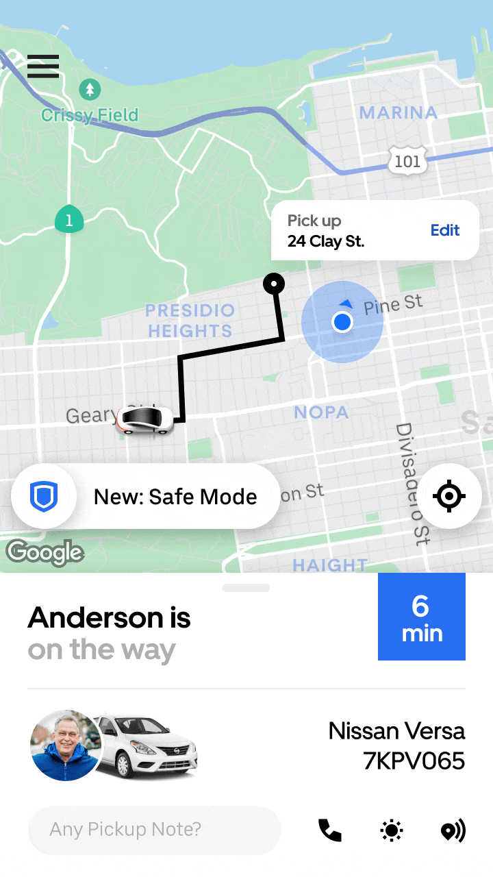
Version 2. With Safe Mode
This safety toolkit bundles features into a “safe mode” in an attempt to save space and allow the user to further customize their safety preference. The prototype includes how “safe mode” is set up and how it’s turned on.
User testing
During our regular product design reviews, our product director wanted to bump up “safe mode” on the roadmap, so we worked with our user research lead to perform some testing in markets with very different safety landscapes: the U.S., India, Mexico, and Brazil. Here’s what we learned:
Our old safety toolkit didn’t invite exploration, so riders appreciate how the new UI looks fresher and makes features more accessible.
Context plays a big role in safety, and riders seek to activate different features along different moments of the trip.
Safe mode doesn’t work as a concept, as riders would prefer to set up each feature separately.
We need to better understand riders’ mental model of safety context as it relates to trip moments.
Based on these findings, my PM and I decided to keep iterating version 1 above and keep a close eye on our future feature launches and how riders set up these new features.
final iteration
I went through a few more iterations of the safety toolkit to find the right balance of information by removing as much information I could, then adding things back until it felt more visually balanced. Here’s where I landed.
Learnings
Unfortunately, I was impacted by Uber’s re-org before this project was completed. The next step would have been to review the final iteration with the product team and move forward with working with engineers. In this project, I found an opportunity for a design-led initiative and worked with a PM to get it on the product roadmap. I fielded increasing scope by clearly aligning the product team on what the goals were and weren’t, and I considered the whole ecosystem of safety features and how they worked together. While trimming the scope, I also learned to push back on what should be in this MVP, and to recommend several parallel projects to be prioritized to complete the safety toolkit. Here are some other learnings:
Clearly define the goals and scope of any design-led initiative. There was some confusion in the beginning regarding if this was a north star vision or a short term redesign because I hadn’t articulated it clearly.
Get buy-in from different stakeholders to drive excitement and alignment during reviews. I checked in with several PMs who worked on safety toolkit features so that they were aware of progress. In return, they would already be bought-in when I presented during product design reviews, and I could work closely with them to maintain the integrity of the core functionality.
When creating a framework, consider each part of the system and how it works with each other and what the rules are. You may need to switch context between individual functionality and whether it still works within the larger framework, making sure the framework as a whole solves for all of the use cases.
Lean into collaboration and don’t be afraid to delegate. I found that brainstorming with designers on different teams helped me iterate quickly to avoid falling into a creative rut. I also initially meant for this project to include the driver-side safety toolkit, and quickly realized I could improve productivity and speed by delegating that portion to other designers on my team who were eager to take on new challenges.