Metromile Expedited Claims
Role
Lead Product Designer
Team
Myself, Product Manager, Content Writer
Time frame
3 months
Challenges
This was Metromile’s first online claims experience so we were designing it from the ground up.
The design had to be cohesive for web, iOS, and Android.
There was uncertainty regarding some of the requirements and capabilities, so designs had to be made with assumptions, then tweaked as we got new information from other internal and external teams.
METRICS
Claims NPS and time to resolve a claim
Background
Metromile had recently acquired a carrier and became its own insurance company, which meant we could handle claims in-house. Before the project was handed off to me, another designer had done in-depth claims research on pain points along the customer journey. Coupled with information from claims adjusters on what happened behind the scenes, and what we could automate into a digital experience, we set out to create the foundation for our digital claims experience.
Process
JOURNEY MAP > DEsign > Iterate > Test > Write stories
In the first release of the claims experience, we would only handle straightforward claims that could be expedited that didn’t involve injuries, multiple vehicles, or a repair facility. I worked with the Product Manager to understand the various touchpoints of a claim and created a journey map to illustrate the various stages, statuses, and notifications we want to send the user.
Claims Journey Map
Using the journey map as a guide, I created screens for each stage of the claim journey for both web and mobile, and worked with the content writer to make sure we were using consistent and clear terminology throughout all touchpoints.
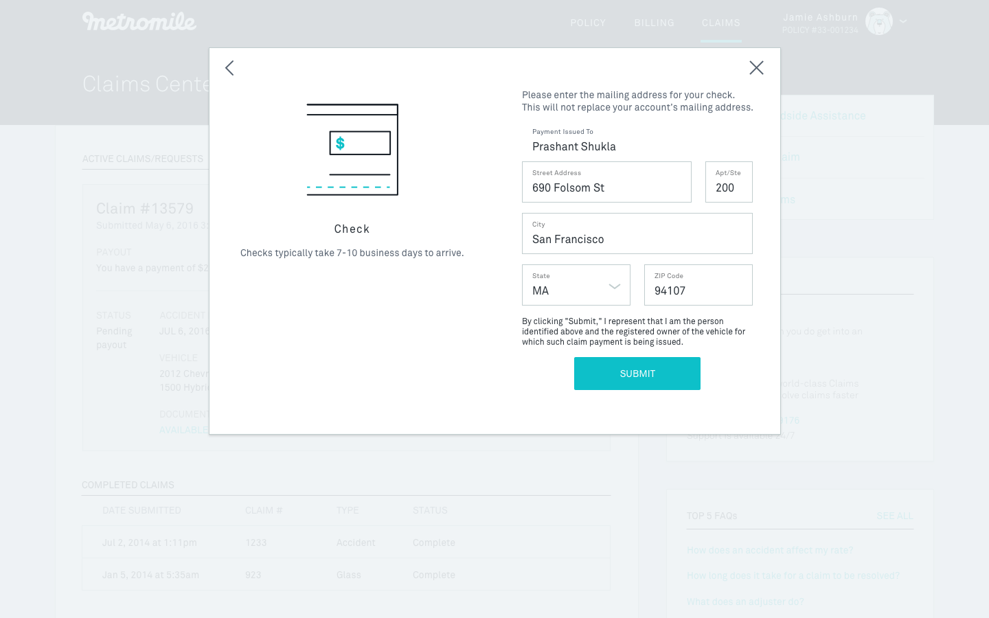
Web experience


iOS experience
Android experience


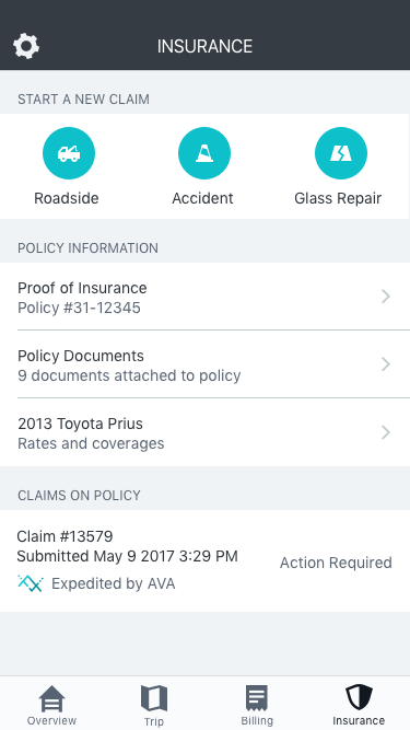


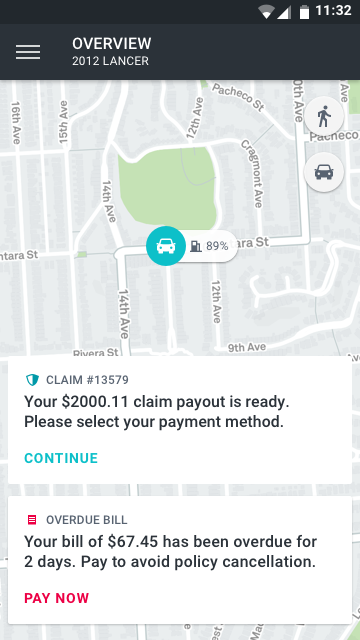


Two of the stages, estimate ready and photos needed, required action from the user so I designed flows that were optimized for either web or mobile, using existing our existing visual design patterns.
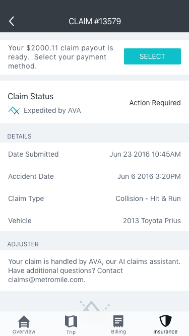
estimate ready
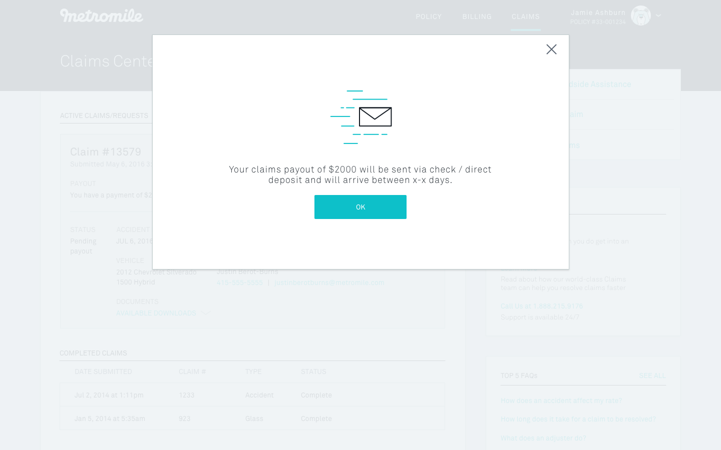
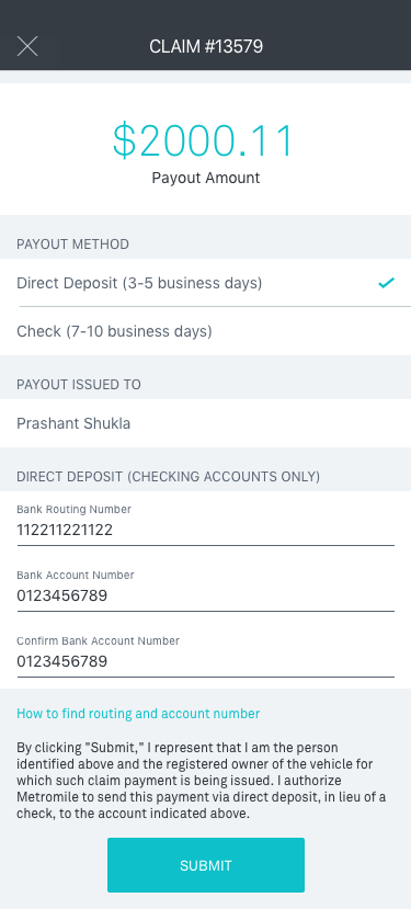
Estimate Ready occurs when we have estimated the damage to the vehicle, and need the user to tell us if they would like a check or direct deposit for their claim payout. I explored a few visual designs highlighting our preferred option, direct deposit, but discovered that legally we were not allowed to default to direct deposit and must either default to check, or highlight both equally. After a few more iterations to confirm the required form fields, I arrived at the final flow.


photos needed
The Photos Needed stage occurs when our adjusters require photos of the damaged vehicle to process the claim. We initially used a 3rd party to request photos over email, but wanted to build a native photo uploader to provide a more seamless claims experience.
Challenges:
- There were ten steps involving taking specific angles of the damage as well as all around the car (perspective photos) that we had to convey clearly to the user.
- The web interface had different acceptance requirements for the damage photos and the perspective photos, so I separated it into two steps, but it wasn’t clear to users what to expect when they first started the flow.
- For the mobile experience, I had to figure out how to combine each step’s instructions with the visual aid and the camera view.
For the web experience, we used an existing photo upload component and tweaked it to fit the requirements for this project.


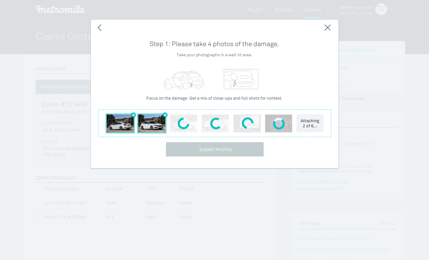


For the mobile experience, I went through 6 rounds of visual iterations before arriving at a solution that combined both the instruction and visual aid on the same camera screen for a lightweight guided experience.


Throughout the iteration process, we met with the web and mobile engineers to get their feedback on implementation details. When the designs were ready to go, I wrote up user stories and tickets for the engineering team.