
Dropbox Shop: Buyer Experience
Role
Product Designer
Team
Myself, Product Designer, UX Researcher, Product Manager, ~4 Engineers, EPD Team Leads, PMM, PM and Eng on Payments team
Time frame
45 days to internal alpha
summary
When Dropbox announced a new team focused on creating a 0-1 e-commerce platform called Dropbox Shop, I was recruited for the opportunity to help define product strategy. The Dropbox Shop team spent a couple of months iterating on the strategy as a team, narrowing down our target users, and creating a north star vision for the e-commerce product. After testing design concepts from the vision and validating the value proposition with users, we were ready to define the MVP and launch an internal alpha version of Dropbox Shop.
In this project, I will be focusing on my contributions to the MVP for the internal alpha launch: using lightweight storytelling and team workshops to define the seller and buyer user journeys, aligning the team on both seller and buyer user flows, and owning the end-to-end buyer flow designs from internal alpha to private beta.
This project demonstrates:
Product strategy thinking
Using design artifacts to drive team alignment
Designing for multiple milestones
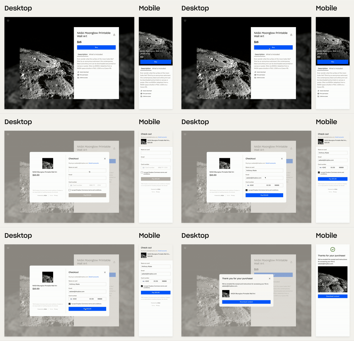
Final design
Challenges
Creating a 0-1 product within an established company meant finding a balance between multi-product UI cohesion and designing for our specific target user
Short project time frame
Design complexity within the checkout flow
Goals
Our goal for Internal Alpha was to test the basic flows and functionality with internal users, so we wanted to onboard 10 internal employees as sellers and have at least 10 total purchases.
Target user
Our target user was defined by our PMM and UX Researcher, who mapped out the creator lifecycle based on multiple rounds of market and user research. Our product would focus on the Opportunist and Planner archetypes, amateur solo content creators who have sold digital content to others, but are looking to find content-market fit, expand their business, and raise brand awareness/build their audience.
The Opportunist’s pain points are:
Lack of secure, easy, and integrated payments
The workflow to monetize and distribute content is fragmented and manual
Lack of content and IP protections
and the Planner’s pain points are:
Inability to view sales, customer, and market insights across multiple platforms
Difficulty growing audience and increasing their revenue
Product definition
To start, our MVP solution would address the Opportunist’s pain points and provide a pay-to-access workflow with integrated payments and frictionless buyer and seller flows. Since most of our target audience was marketing on social media, they would be able to distribute their product listings through link sharing.
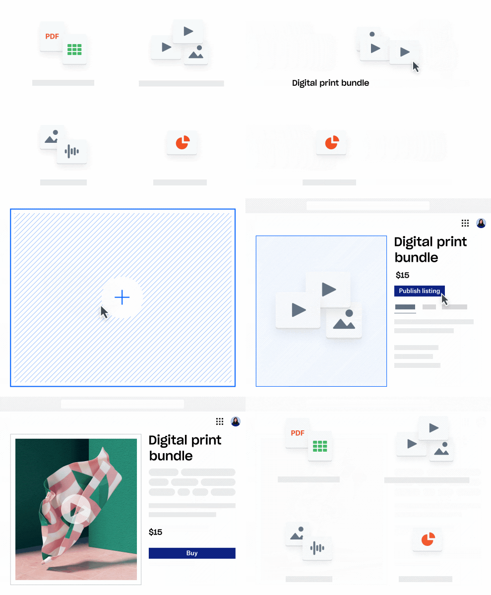
Our brand team created this concept visual for us to use internally to illustrate our initial product offering
Customer Narrative
To help our team imagine what our MVP solution could be and understand the tradeoffs in parts of the buyer and seller flow, I created a lightweight version of Snow White frames, a storytelling approach used by Airbnb to illustrate the customer’s journey in using the product. True to Dropbox fashion, I created a Paper doc to tell the (written) story of Alex, a part-time illustrator who sells digital prints on Dropbox Shop, and Jaime, an art collector who finds and purchases Alex’s new digital print release. I outlined parts of the story (blue highlights below) where there were multiple ways to accomplish something, and conducted a team brainstorm centered around these How Might We’s and considerations to come up with solutions. The team voted on the ideas, I grouped them, and this quick and scrappy exercise allowed us to :
align on the core seller and buyer experiences across all stakeholders,
decide what was out of scope for the MVP, and
start early discussions on options and tradeoffs, like customizing or shortening a product listing URL, and integrating with Stripe or hosting our own dashboard.
The seller’s journey
The buyer’s journey was more lightweight and straightforward as we prioritized the seller experience for the MVP
User flows
To help visualize the actual seller and buyer flows, and especially how they intersected each other, I created user flows to further align the product and engineering teams on what we were building at a high level. (Download the flow in high resolution)
Seller and buyer flow. Note that since the MVP would be launched internally at first, we descoped “guest checkout” and “create an account” from the buyer checkout flow.
explorations
At this point, I was assigned to do the explorations and visuals for the buyer experience, while the other product designer owned the seller experience, although we often brainstormed together and riffed off each other’s ideas. After doing some competitive analysis on other e-commerce product listing pages, I started with some high level wireframes to mock up different layouts.
Layout exploration for the buyer’s view of the product listing and how the checkout piece interacts with the listing page
Product listing
When I explored the product listing from the buyer’s perspective, I mocked up a few visual designs using existing design system components before switching to a mobile-first exploration. Our research and journey indicated that buyers were most likely to be using their mobile device to consume content creators’ social media posts and shops.
Desktop layout explorations
Mobile explorations. Variations in cover image, gallery/preview indicators, buy button placement, and listing details.
Checkout
For the checkout flow, my strategy was to explore the checkout container separate from the product listing page first, then assemble the whole experience together.
Our first assumption was that the checkout needed to be a 2-step process where you fill in 1) who will access the file, then 2) your payment information. This is because we integrated with Stripe as our payment processor, thought we needed a separate place to capture where to send the access link, and also unnecessarily complicated this flow by asking “what if you purchased something as a gift and wanted to send it to someone else?”. I began with this full list of “required” inputs, showed my team that this was too much friction, and eventually reduced it down to just three fields with close collaboration with the Dropbox Payments team.
Checkout field options: multi-step, single step, and shortened single step, and final.
The other exploration for the checkout flow involved looking at where it made sense to ask users to login to an existing account, choose guest checkout, or create an account. The high level options I identified were to add a login link to the checkout flow (rather than have users explicitly select a checkout option — which is what Shopify does), and an additional optional password field either before or after the checkout if the buyer wanted to create an account. Ultimately, this decision was punted from Internal Alpha since we were only testing with Dropbox employees to start (who would already be logged in), but this helped make sure the simple checkout flow could scale once we added in these other ways to check out.
Finally, I explored some of the layout wireframes for checkout from earlier, and played around with the listing details as part of the checkout process.
Desktop explorations for the checkout layout
user testing
With our first core buyer experience explored, I put together a user test on UserTesting to understand:
What core pieces of information does the buyer need to decide on making a purchase?
What are the perceptions and preferences around logging in, creating an account, and checking out as a guest, and would having to sign up for a Dropbox account deter buyers from completing the purchase?
What are expectations around file access post-purchase given how the user chose to check out, and does that change if they purchased a file for download vs. a file for viewing?
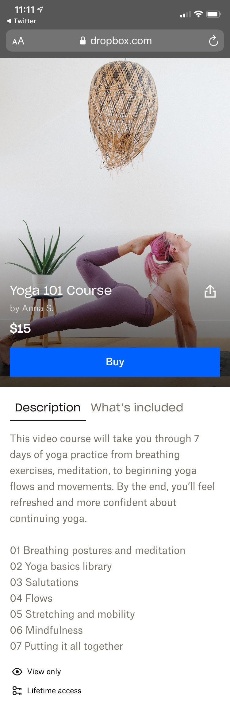
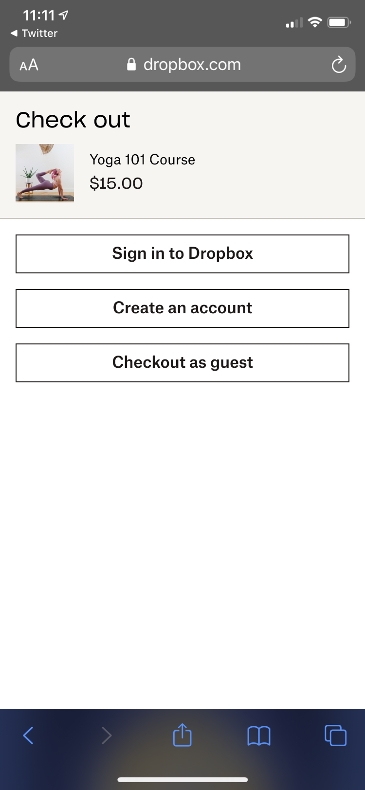
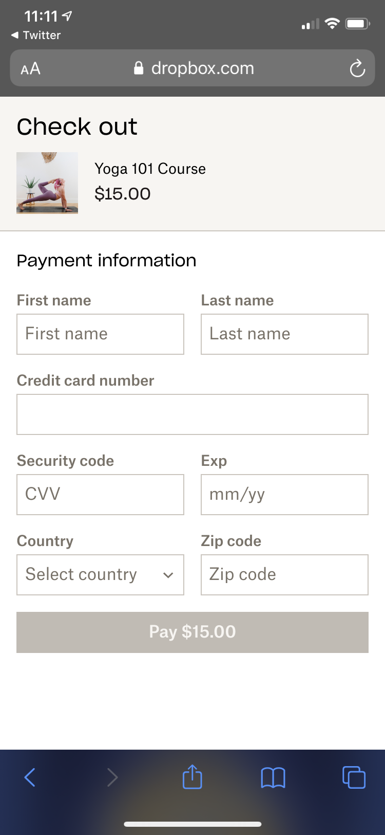
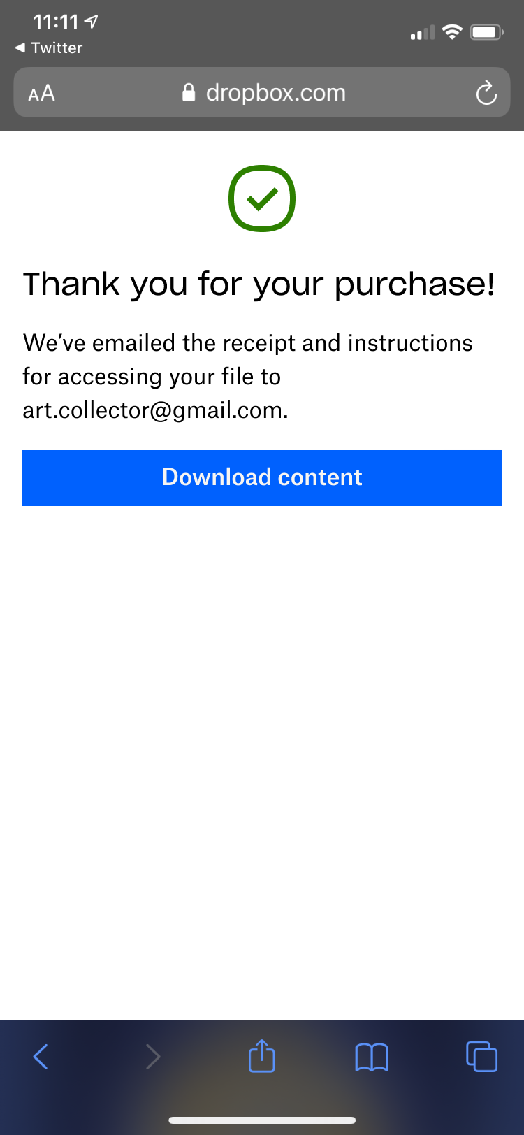
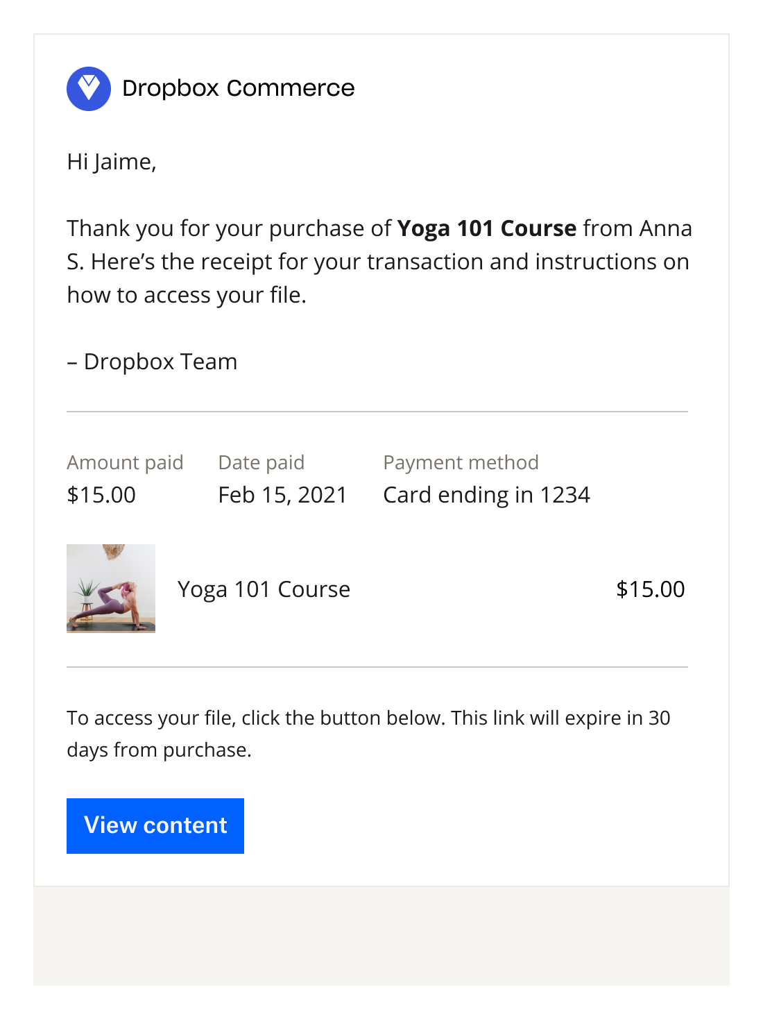
We recruited 11 people who have purchased digital content online, and a mix of Dropbox and non-Dropbox users. This would help us understand their mental models of checking out and expectations of file access post-purchase. Because this was an unmoderated test, our researcher suggested that we use static screens, as participants have gotten stuck on Figma prototypes in the past.
Research findings
Our research findings indicated that overall, the checkout flow and confirmation screen and email met expectations. Participants leaned towards guest checkout if they don’t already have an account, but 9 out of 11 participants would still go through with the purchase if guest checkout wasn’t available. Participants understood and expected that certain types of listings (such as courses) would be view-only rather than be available for download, but needed more explanation on the product listing page as to what “view only” means so that they understand what they’re getting before buying the content (this would inform our pay-to-view download that we worked on months later).
We also learned about the top factors that influence whether a buyer would purchase a listing, which includes a detailed description of exactly what they are getting (e.g., duration of a course and detailed table of contents), and more information about the seller to validate their expertise. This finding would influence the design and inclusion of the seller profile, and a full-screen product detail page post-MVP.
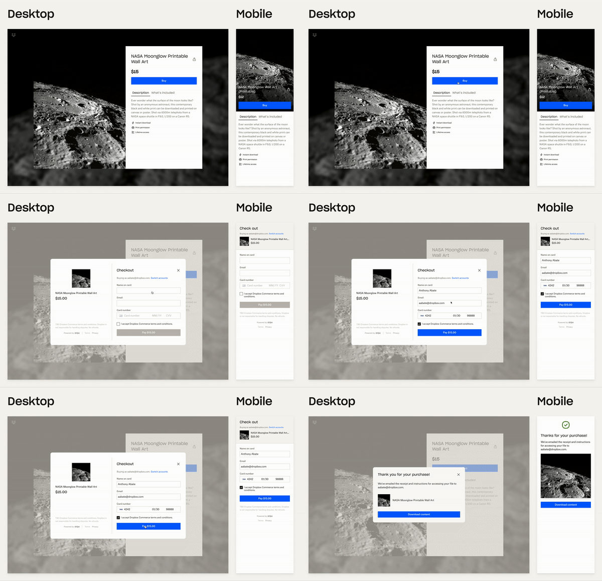
Final MVP experience
Here is the final MVP experience that we launched for internal alpha.
Epilogue
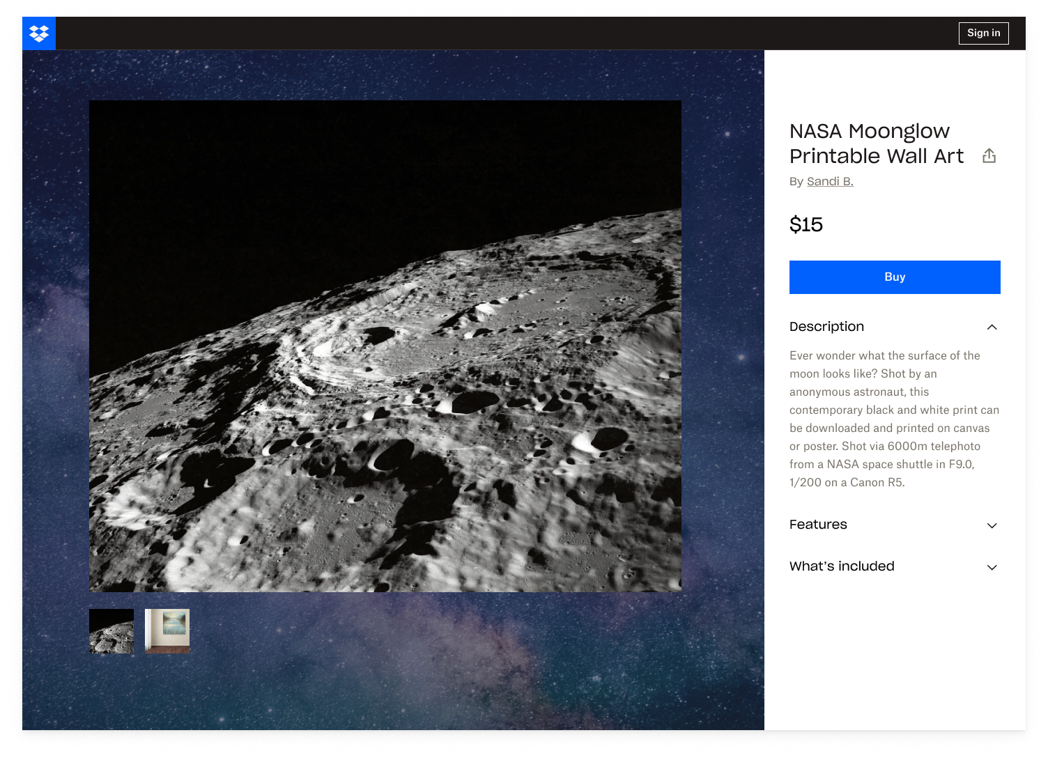
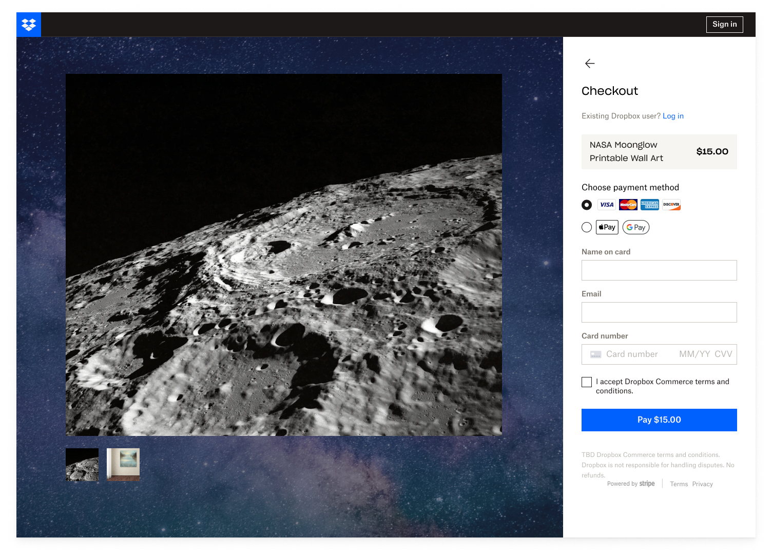
The way we launched Shop in the early days was based on milestones. Shortly after the internal alpha (launched Q2 2021 with more than 10 internal employees and 10 purchases within the first day), we launched an external alpha, private beta, and are currently now in public beta (Q2 2022). Here’s a peek at how the buyer experience changed between internal and external alpha.

Learnings
Joining Shop stretched my product strategy thinking by learning how to use a crawl/walk/run approach to creating a 0-1 product and thinking about how we were going to differentiate. I used quick and scrappy design methods to achieve team alignment efficiently, learned how to quickly iterate from internal alpha all the way up to private beta, and checked in frequently with the seller designs to ensure we were creating a cohesive experience.
Finally, from a metric standpoint, it was important to align the metrics with the stage we were in. For internal alpha, our metric was to successfully onboard 10 employees and get at least 10 total buyers. For external alpha to beta, we started looking at Sean Ellis scores, CSAT, monthly active users, activation and retention.