Dropbox: Admin progress indicator
Role
Lead Product Designer
Team
Myself, Designers on the Enterprise team, Product Manager, Engineer, Content Writer, Design collaborators on multiple teams.
Time frame
~6 weeks
summary
Admins of Dropbox teams perform multiple tasks that take various amounts of time to complete, such as transferring members from one team to another, creating legal holds, exporting reports, or classifying files. It’s not always clear how long these processes will take, either. While working on a feature to transfer members from one team to another, I discovered the same need to have awareness of progress in other projects on our roadmap, so I spearheaded the effort to create a progress indicator for the Admin Console, and worked to make sure this new component fit the needs and requirements of other teams.
This project demonstrates:
A self-initiated, design-led project that I advocated for and rallied stakeholders around
Framework and systems-thinking across different features
Cross-team collaboration between Design Systems and Surfaces teams (a team that oversaw the various surfaces of Dropbox, such as the global navigation, right rail, etc.)
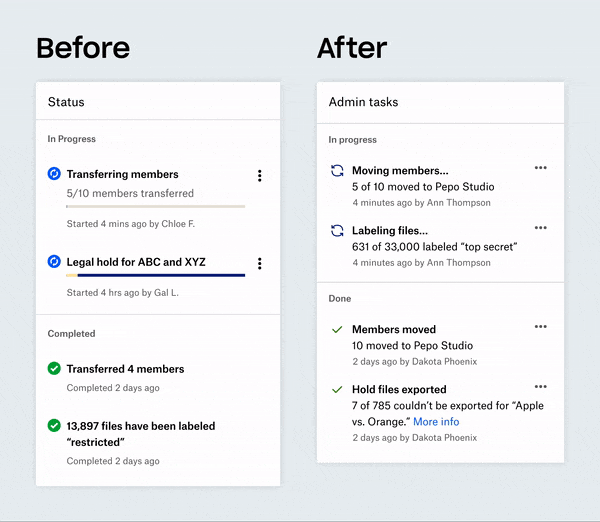
Final design
Final design of the progress indicator in the admin console
Challenges
Systems-thinking across different use cases that involved considering the end-to-end flow of multiple features and creating a flexible component with customized actions depending on the feature using it
Collaborating with the Surfaces team to find an entrypoint for the progress indicator that fit their design principles for the global navigation
METRICS
The metrics depended on the feature using the progress indicator, and involved 1) engagement, such how many times actions (e.g., pause, cancel) were triggered, and 2) discoverability, how often the entrypoint was triggered. Both were important considerations to the Surfaces team in the decision to keep the entrypoint in the global navigation.
Background
I was working on a feature that allowed Dropbox team admins to move members from one team to another team, which can take hours if moving thousands of team members due to reorgs, mergers & acquisitions, or other company-changing events. I was aware of other features on our roadmap that had similar processes.
Member transfer modal
Use cases
The first step I took was to gather the various use cases, user needs, and launch dates so that we could plan out design requirements and figure out sequencing. The 6 features included:
Member transfer: lets admins transfer members from one team to another.
Legal holds: enables team admins to keep a copy of content in preparation for litigation, or other uses. This can take just a few seconds to a few hours, and there is no way of knowing how long it may take.
Data retention & disposition: allows companies to set rules around how long data is retained and when it should disposed. Admin can create/edit policies, create reports, and create exports of policies to download content.
External sharing report: allows admins to see and query files, folders, and links that were shared externally.
Data classification: searching and classifying files.
Reports: creates reports for the insight dashboard and activity pages of the admin console.
Competitive Analysis
I looked at competitors to see how they were handling progress of tasks. They all used either a bar chart or circular progress indicator to display the progress, but varied in placement (e.g., bottom snackbar, lower right pop-up).

Competitive analysis of progress indicators from (top to bottom): Google, Outlook, Microsoft, and Slack.
Explorations
My initial explorations focused on high level approaches to displaying the progress indicator. For each exploration, I detailed the pros, cons, and considerations.
Option 1
In-modal progress bar

Member Transfer and Legal Holds included a flow contained in a modal, so one obvious choice was to keep the progress bar inside the modal after the main flow.
Pros
Lightweight and in-flow
Cons
Limited space to display additional information or actions
Admin might feel like they can’t quit out of the modal, unless there were a place to get view the progress after closing modal
No way to get back to view progress, especially for multiple features
Considerations
Can we make this asynchronous (i.e. ability to leave the modal or page and not cancel the transfer)
Option 2
Snackbar

In this exploration, when the process is initiated from a modal, the modal is closed and admins can see a progress bar at the bottom of the screen.
Pros
Existing component, likely plug-and-play
Shows up regardless of page navigation (persistent)
Cons
Overlaps with any file transfer snackbars that might be happening concurrently
Limited space to display additional information or actions
Poor scaling behavior if there are multiple transfers happening
Considerations
How often would admins be performing actions that have a progress while uploading files at the same time?
Maybe there could be stacked snack bars, or some kind of aggregated view (i.e., Box).
Option 3
Separate page

By creating a separate progress page, admins can see the progress if any number of processes and take action on them.
Pros
Fully featured, allows admin to view more details and multiple processes
Easiest from implementation perspective
Cons
Larger initiative to build with unclear usage beyond legal holds and member transfer for now
More cognitive load as the admin might just quickly want to see a quick status and continue working
Considerations
How different kinds of progress look together (known vs. unknown progress)
Could potentially pair with one of the more lightweight explorations for notification as the detailed view
How would an admin access this page? Where would the entrypoint be?
Option 4
Notifications popover

Uses the notification popover surface area to include status about processes.
Pros
Existing surface area/pattern
Persistent even if you move to another tab
Cons
Estimated around 1-2 additional sprints of work (requires having it on every page and not all pages inherit the same header
Could potentially get buried amongst other notifications
Considerations
Doesn’t have to be notifications tab, could be a separate entrypoint next to current notifications
Wireframe brainstorm
After landing on the notification popover, I hosted a team brainstorm so each designer who owned a specific feature could wireframe out what their feature would look like in a notification popover.
Visual explorations
From the wireframe brainstorm, I started creating the various components of the progress indicator using the Dropbox design system to iterate quickly. Using the principles of Atomic Design, I created a visual representation of a single task (the molecule) created from design system components (the atoms), to form the progress indicator (the organism).
The Task
The various task and interaction states for a single task. The progress bars were existing components with determinate (yellow section on the left) and indeterminate (yellow section within dark blue) variants.
The Features

Documenting the various states and copy for each feature.
The Framework

The progress indicator and its states.
Other Explorations

Other visual explorations: Changing the colors of the progress bar for better accessibility, plus exploring how actions show up in each task row.
User testing
Since I was working on the progress indicator in the context of the Member Transfer project, I incorporated the progress indicator along with testing the main Member Transfer user flow to see if the progress indicator made sense in the context of that flow. I used UserTesting, and once the participants (who were Dropbox admins) completed the main flow, I asked them to check on the status of the task, and all 4 them were able to find it successfully (it is notoriously difficult to recruit for Dropbox admins). Here is a video of the prototype I used.
Revisiting the Entrypoint
When we were almost done wrapping up the progress indicator, we learned of another team at Dropbox who were stewards of the global navigation where we wanted to place the entrypoint: the Surfaces team. They made a strong case against having the progress indicator in the global navigation since that area was meant for persistent actions or navigation across Dropbox products, and admins arguably didn’t need the progress indicator if they were using Dropbox in the non-admin context. We went back to the drawing board to explore other alternative placements for the progress indicator.
Additional entrypoint explorations for the progress indicator
The Enterprise team had a hypothesis that admins were mainly using the Admin Console when they are using the Dropbox website, and through this round of explorations, we felt strongly that the progress indicator belonged in the global navigation. We compromised by framing the original proposed placement as an experiment where we would track engagement of the progress indicator to see if it warranted the prominent spot.
Final visual design
Working closely with a member of the design systems team, we formalized the creation of the Progress Indicator as an official Enterprise component. Seeing the progress bar in action, we decided to remove it and made the case for a simple progress bar with colors that had better contrast. We also replaced the icons with new ones that the team had just launched.
Epilogue & Learnings
Unfortunately, a Dropbox-wide re-org happened soon after my team launched Member Transfer and the progress indicator, so we weren’t able to follow-up on the experiment. Additionally, the Design Systems team eventually launched a new global navigation header across Dropbox, and the progress indicator was dropped from the Admin Console.
However, this project still taught me:
How to drive a design-led project by rallying stakeholders towards a common goal and use case
How to use systems-thinking across different features to create a common framework
How to fight for our users and compromise with the needs of other teams and principles of other Dropbox surfaces