Uber Share Trip (Recipient Experience)
Role
Lead Product Designer
Team
Myself, Product Manager, Android & iOS Engineers, UX Writer
Time frame
2 months
Summary
I redesigned our most used safety feature for riders and drivers to improve the experience and standardize designs across different platforms. The recipient experience for Share Trip was using an old tech stack and showed very basic information about a rider’s trip. This is an example of a more straightforward project from a process standpoint.
Challenges
Working with the larger rider product team to balance tradeoffs with different entrypoint options and navigating conflicting feedback between stakeholders.
There were no deep usage metrics on how riders are using the existing feature, and no user research resources for testing.
METRICS
% MAU (monthly active users) who share a trip, % trips shared
Background
Sharing a trip is the most-used safety feature in Uber’s safety toolkit for riders and drivers. Riders primarily share their trip with recipients to communicate ETA status, and drivers share trips with their loved ones so they always know where they are. This recipient experience had not been updated since it was first implemented over 1.5 years ago, and was not only on an old tech stack, making it buggy and harder to update, but had the following issues:
The rider and driver recipient UIs were different, which meant engineers had to update two systems and component sets, and new features could not be added in a consistent way. Mobile web also had a different design.
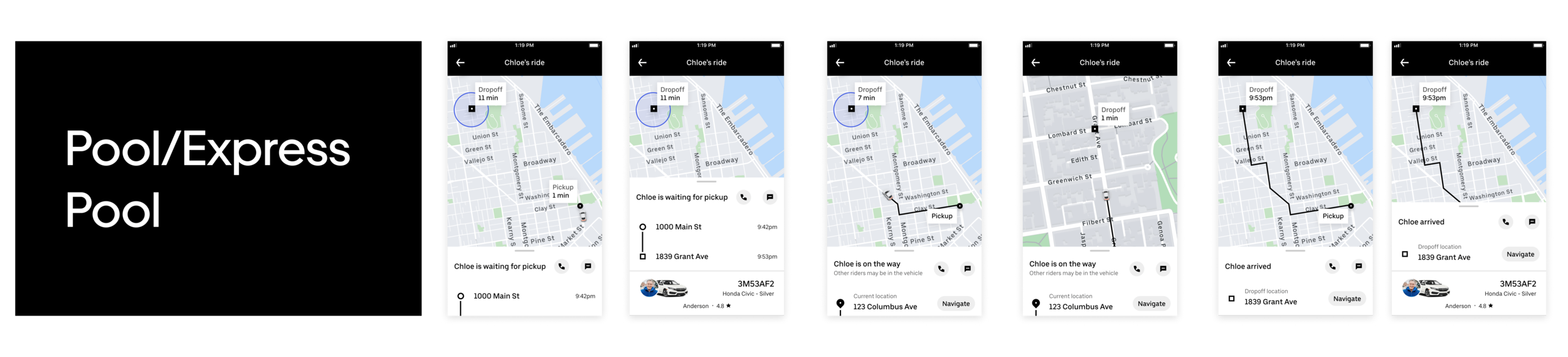
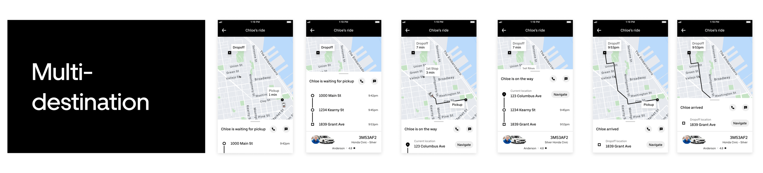
There was no support for Pool or HCV (high-capacity vehicle, i.e., buses) trips, nor multi-destinations, so recipients didn’t know if and why the rider might be taking longer than expected.
If the recipient has the Uber app installed, sometimes they wouldn’t be able to see the in-app message that someone has shared a trip with them, and thus unable to access the trip that is being shared.
There was an opportunity to create a more transparent sharing experience, standardize the experience for faster future iterations, and define a clearer heads-up experience using push notifications to communicate key pieces of information rather than require the recipient to open the app.
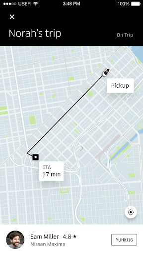
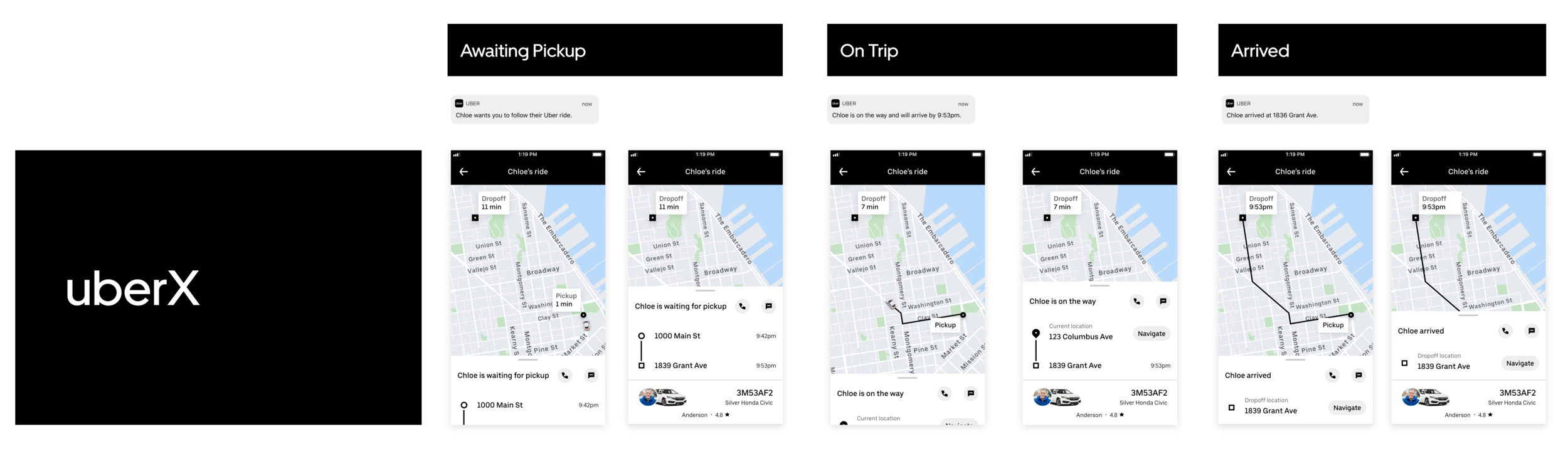
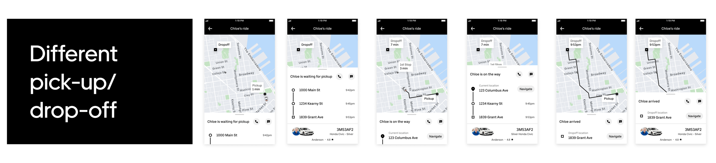
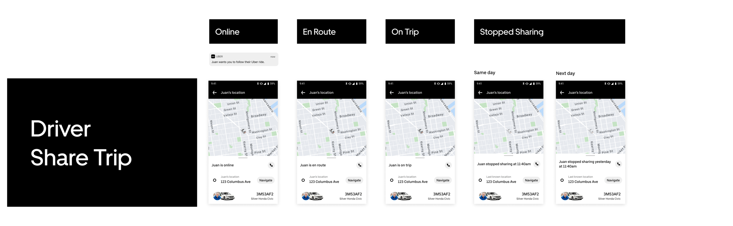
Screens of the old experience:
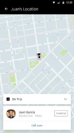

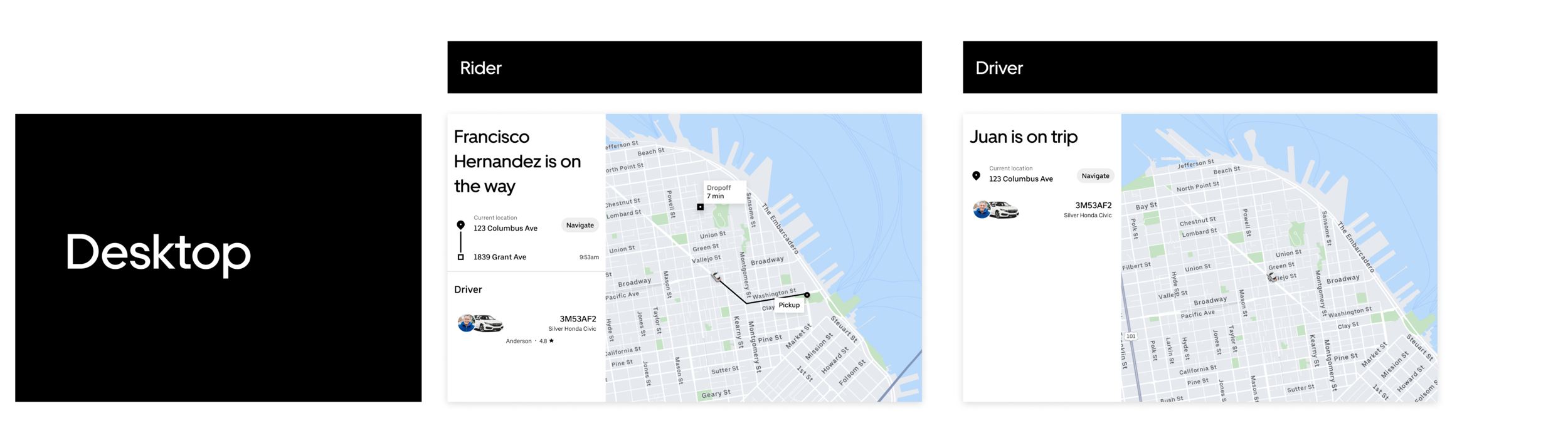
This project was one of the more straightforward ones that I worked on at Uber. The problem and approach were clearly defined, and I was updating the experience to the new design system while adding on new features. Since the driver experience displayed less information than the rider experience (to protect riders’ privacy), I made sure to constantly check to see if the rider system worked for drivers as well, and I also kept in mind how the experience would translate to mobile web and desktop.
explore
I started by mapping the different components of the system to include different product offerings (e.g., UberX, Uber Pool) across different trip states so I had a high-level view of what needed to be done.

iterate
I identified a few components that needed in-depth iteration, and periodically made sure the explorations still fit within the larger system above.
Bottom sheet: How is the rider and driver information organized?
Trip progress/itinerary: What is the minimum amount of information for each of the trip states to make this useful for the recipient?
Entrypoint alternatives: How can we design an entrypoint to this feature that fits within the larger rider messaging framework?
Trip information
Here are a few of the bottom sheet and trip progress iterations. The challenge with the information hierarchy was knowing which pieces of information the rider found the most useful and organizing it in a way so that one piece of information flowed into the next. I also iterated on the header, removing it to create more breathing room for the UI, and eventually adding it back in to distinguish between the viewer being on a trip themselves. With the help of a UX writer, we were able to make the language more consistent and natural-sounding.


Entrypoint
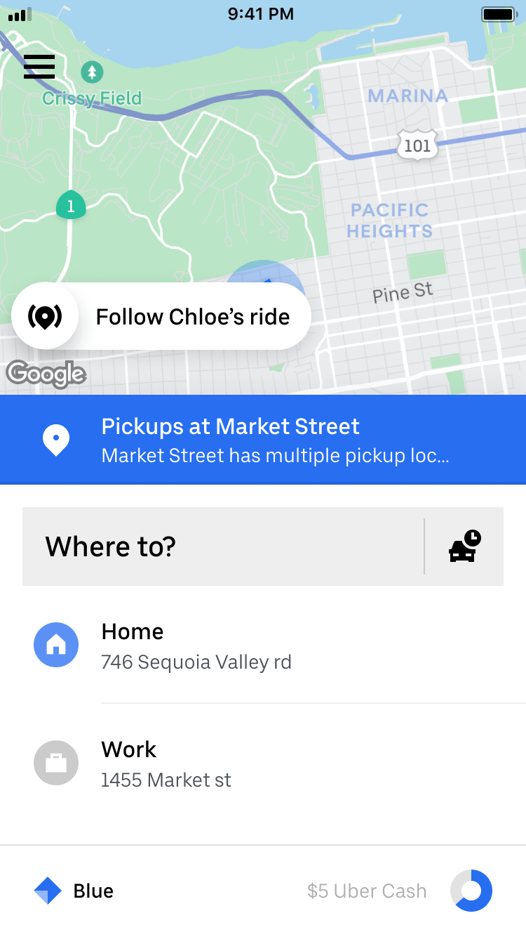
The original entrypoint to this feature in the recipient’s rider app uses a messaging framework that displays the highest tier message on the home screen. Share Trip is a tier 1 message, which means that it will be superseded by tier 0 messages (which includes expired credit cards and venues and events wayfinding messages that are crucial before booking a trip). We did not have the data science resources at the time to figure out how often this was happening, so I explored other ways to keep this in-app notification persistent.
Option 1. Make Share Trip a tier 0 message
The easiest choice was to make Share Trip a T0 message, however the rider product team was split on this option as it was unclear how often it would conflict with existing T0 messages.

Option 2. Create an offline safety toolkit
Since the safety toolkit was not available off-trip and it was something that our team wanted to make happen, I proposed using Share Trip as the first off-trip use case.


Option 3. Lightweight safety toolkit
Similar to option 2, I created a more pared-down version of the off-trip safety toolkit that would allow engineers to build faster for an MVP.

Based on the stakeholder reviews, we went with option 1 as the most lightweight and most on-framework direction. The rider team was excited to see the emergence of an offline safety toolkit, but wanted us to prioritize that as a separate project to make sure we consider all use cases and possible states.
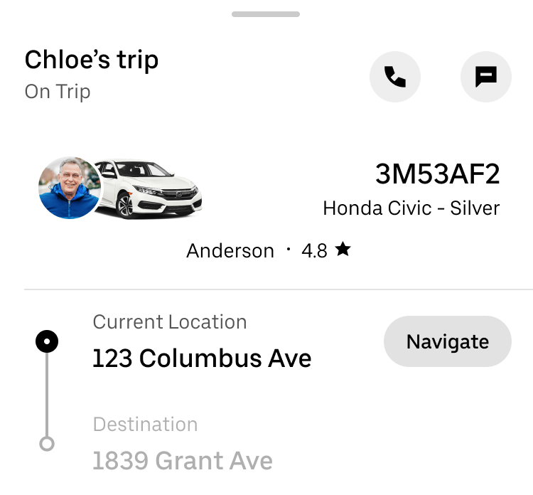
Final designs
I went through 3 iterations, and after each iteration would be a stakeholder review, either with the safety product design team or the rider product and design teams. The final design:
Allows recipients to follow the ride through just push notifications.
Focuses on the route of the trip, which solves for the main use case of sharing ETA, while protecting riders’ privacy when a driver shares a trip.
Allows recipients to contact the person on a trip or see their exact location for coordinating purposes, with the driver information being last in case of emergencies.
Differentiates between a recipient’s Uber’s trip and a trip that’s been shared with them.
Nudges users to download the Uber app if they are viewing on a mobile web browser.

Handoff to eng
Since the engineers were involved in the iteration process, we were able to discuss most of the tradeoffs before getting to close to the final designs. One issue that came up later was that the system that handled address parsing would consistently return addresses formatted differently as the rider went down the same road. Sometimes it would say “123 Main St.” but then switch to “Hwy 28” if the road overlapped with a highway, and “Main St. and 2nd St.” if it passed by an intersection. Because the current location in the bottom sheet updated every 5 seconds, we made the decision to hide the bottom sheet even further so the recipient would see this only if they wanted to know the current address of the rider.
Learnings
Since this was a more straightforward project design-wise, the main things I learned were:
Presenting to cross-functional product and design leads. The expectation was that everyone would have done an offline read of the deck 24 hrs before the meeting, so I came prepared with high-level discussion points to guide the conversation during the actual meeting. This included only showing 2-3 recommended directions, rather than all the possible solutions to a problem.
Ensuring user privacy across all platforms. I had to make design tradeoffs in the itinerary to show fewer details about potential co-riders’ dropoff spots while setting clear expectations for the recipient that this rider may be taking an indirect route. My PM and I also initially wanted to add a message/call functionality across rider/driver and native/mobile web, but we discovered that texting a driver could be problematic, and we couldn’t offer call/text on web experiences because anyone could be accessing the share trip link and not just the recipient. We worked closely with privacy counsel to make sure these issues were captured early on, but on teams where there isn’t a close relationship with a legal, policy, or privacy team, we should always question the tradeoffs of showing various personal information as innocuous or beneficial as it may seem.