Metromile Self-Service Policy Changes
Role
Lead Product Designer
Team
Myself, Product Design Team, Product Manager
Time frame
3 months
Challenges
The product had a complex flow that had to fit within the existing Dashboard.
There were many decision trees that had to be captured in the flow.
It would have a staggered release, so the interface had to make sense with just one feature and scale as we added new features.
METRICS
Reduction in call and email volume
Background
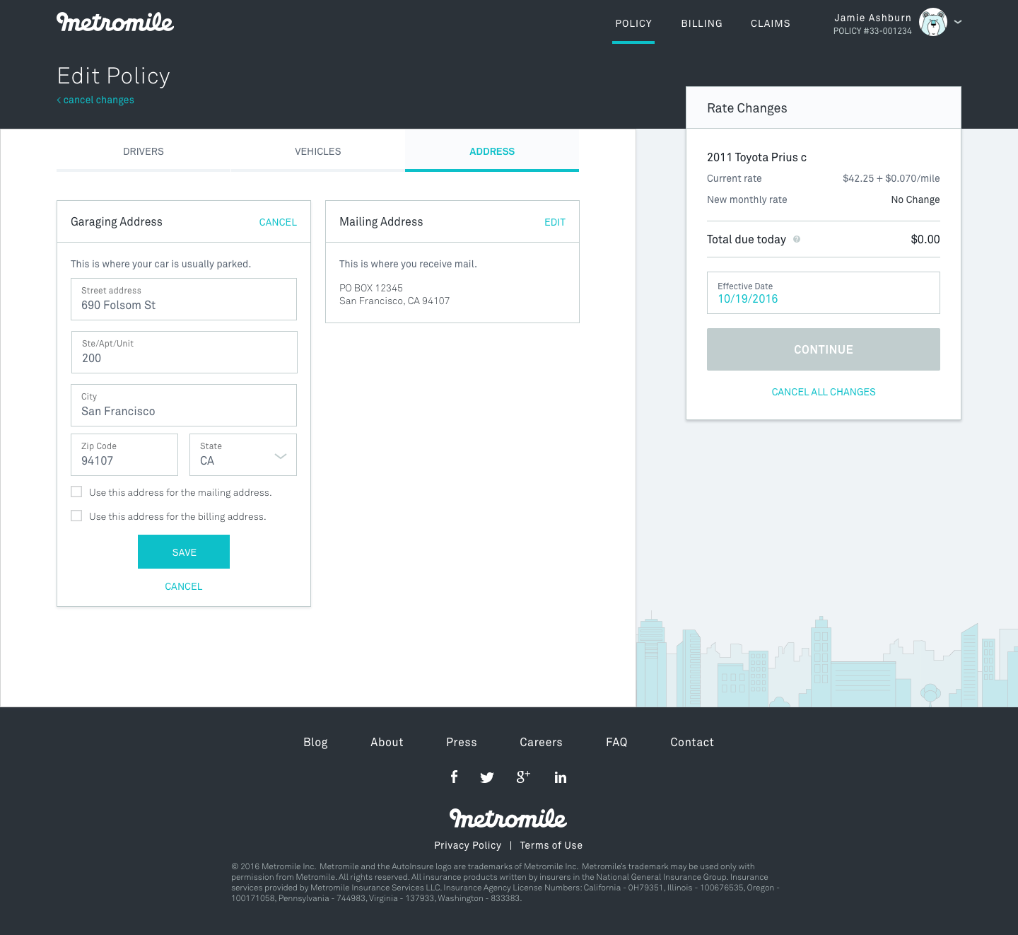
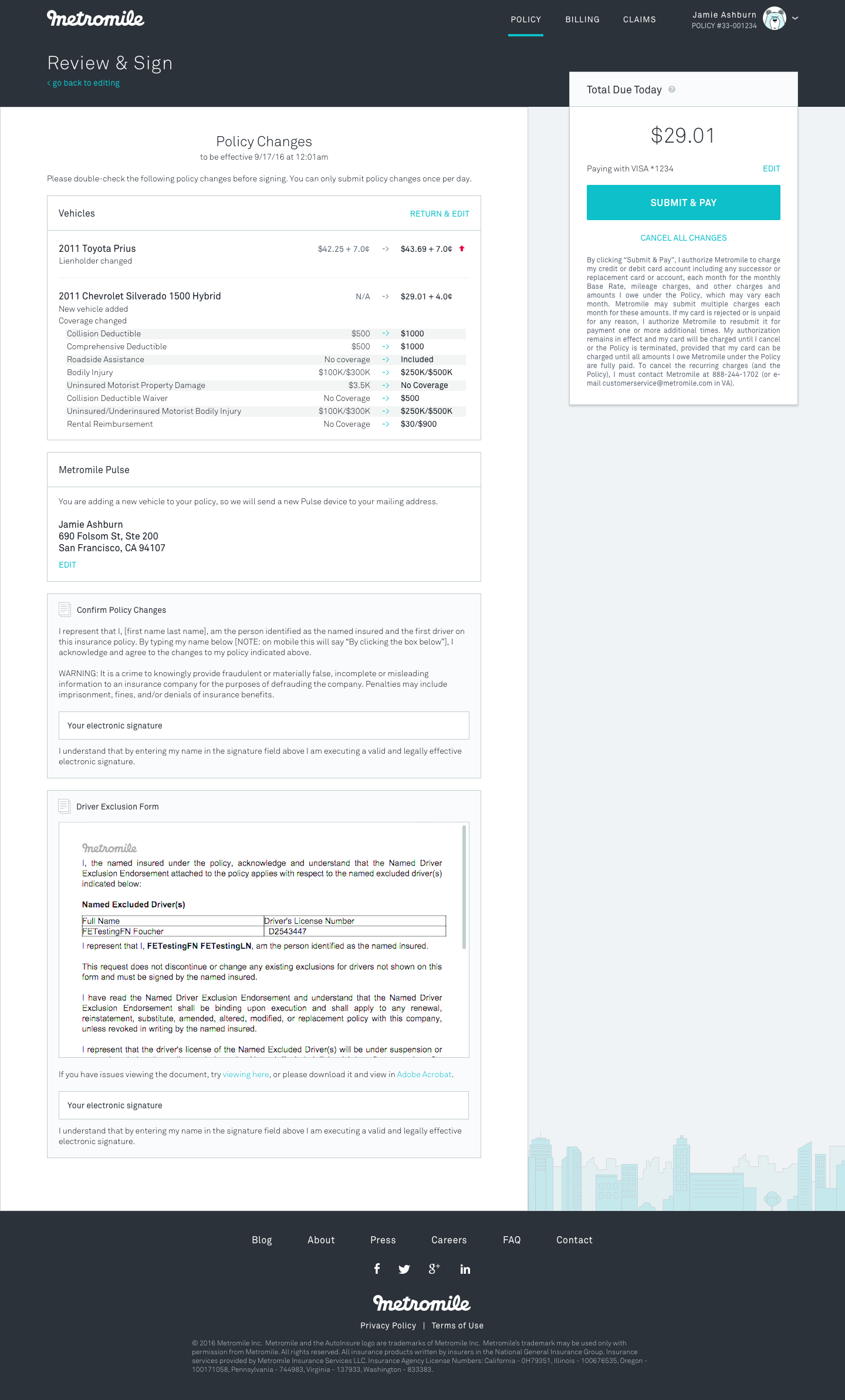
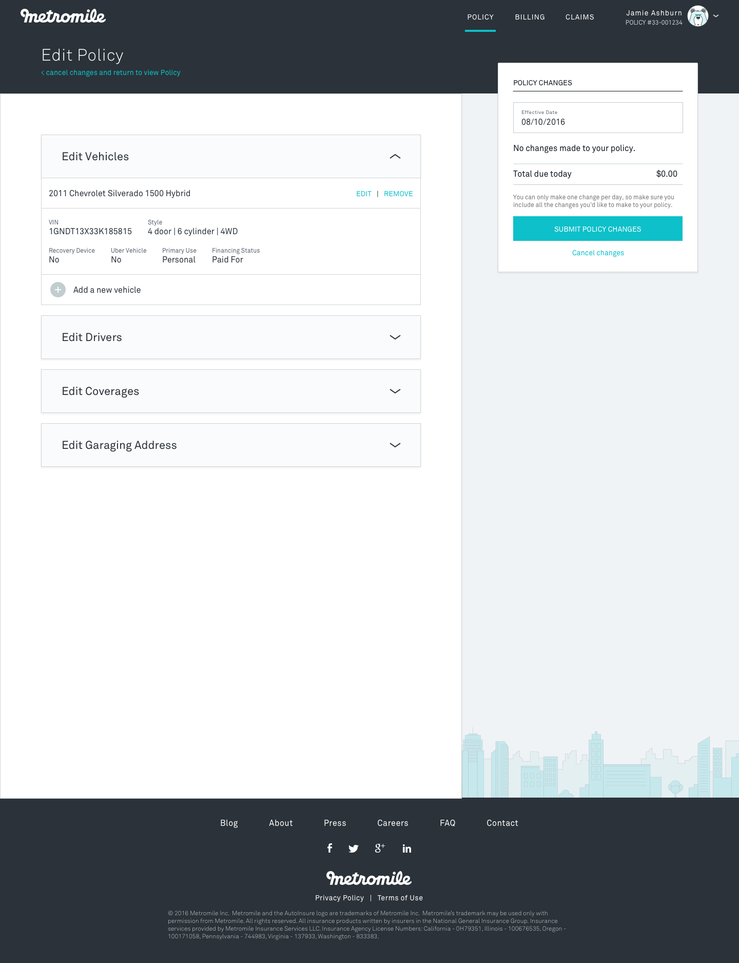
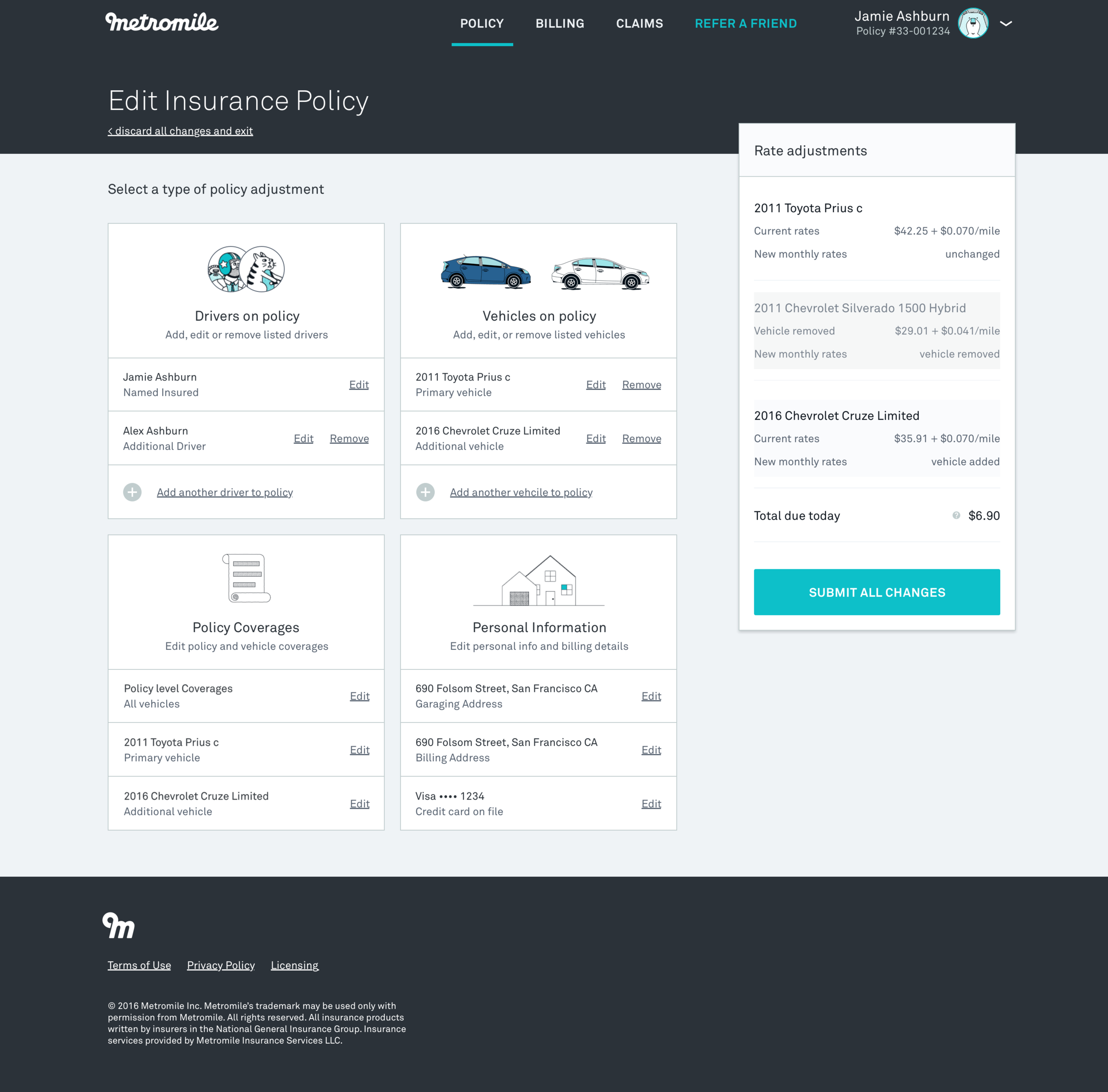
Self-service policy changes allows customers to make edits to their policy online instead of calling in. Before this feature, Metromile customers could only call in if they wanted to edit vehicles, drivers, or change coverages on their policy, resulting in high call and email volume for the customer experience team.
Process
Gather Requirements > Sketch > Wireframe > Test > Iterate > Visual Design
I met with the product manager to gather and understand the requirements of this product and limitations of our backend, and created a flow chart to visualize the process. The product design team sketched various layouts, which surfaced design questions that influenced subsequent explorations.


Design questions:
- Do we create a tailored flow (like a wizard) depending on what the user wants to change, allow them to freely move between sections in the same view, or allow separate entry points to each edit/add functionality and one view for reviewing updates?
- Should we show one big edit button that takes you through a flow, or separate add/edit/remove/update CTAs for each action? If the latter, how do we tie it back to the whole flow to allow them to edit other things?
I explored wireframe solutions to these design questions.


With input from the design team, I narrowed down the wireframes to 2 divergent flows to user test. I used RITE testing with 5 internal and 9 external users, and iterated in between tests.
pre-user test:


post-user test:


The team ultimately decided to go with the direction on the left because it provided more context to what the user was editing, and was less overwhelming. From there on, I fleshed out the rest of the screens, states, and corner cases with frequent input from the product manager and customer experience team.