Metromile Dashboard Redesign
Role
Lead Product Designer
Team
Myself, Product Manager, Product Design Team, Front-end Engineers, members from the Claims and Service teams.
Time frame
6 months
Challenges
We were redesigning our core product experience from the ground up, including visual design.
There were stakeholders from all across the company who wanted to have a say in what features were built.
We were pivoting from a data-centered dashboard to an insurance centered one.
METRICS
Increase engagement and NPS
Background
The dashboard is the Metromile customer's portal into their trips, policy information, billing details, and claims center. Initially, it displayed data about the customer’s driving habits, such as miles per day, average MPG, and ideal time to leave for their commute. I implemented several of these data visualizations and maintained the site for a short amount of time as the only front-end developer.
Since acquiring our own carrier and becoming Metromile Insurance Company, we’ve started to focus more on basic insurance features to provide customers an online experience they've come to expect from competitors. After a few rebranding efforts, it was time to give our the dashboard a makeover to match our new focus as a company.
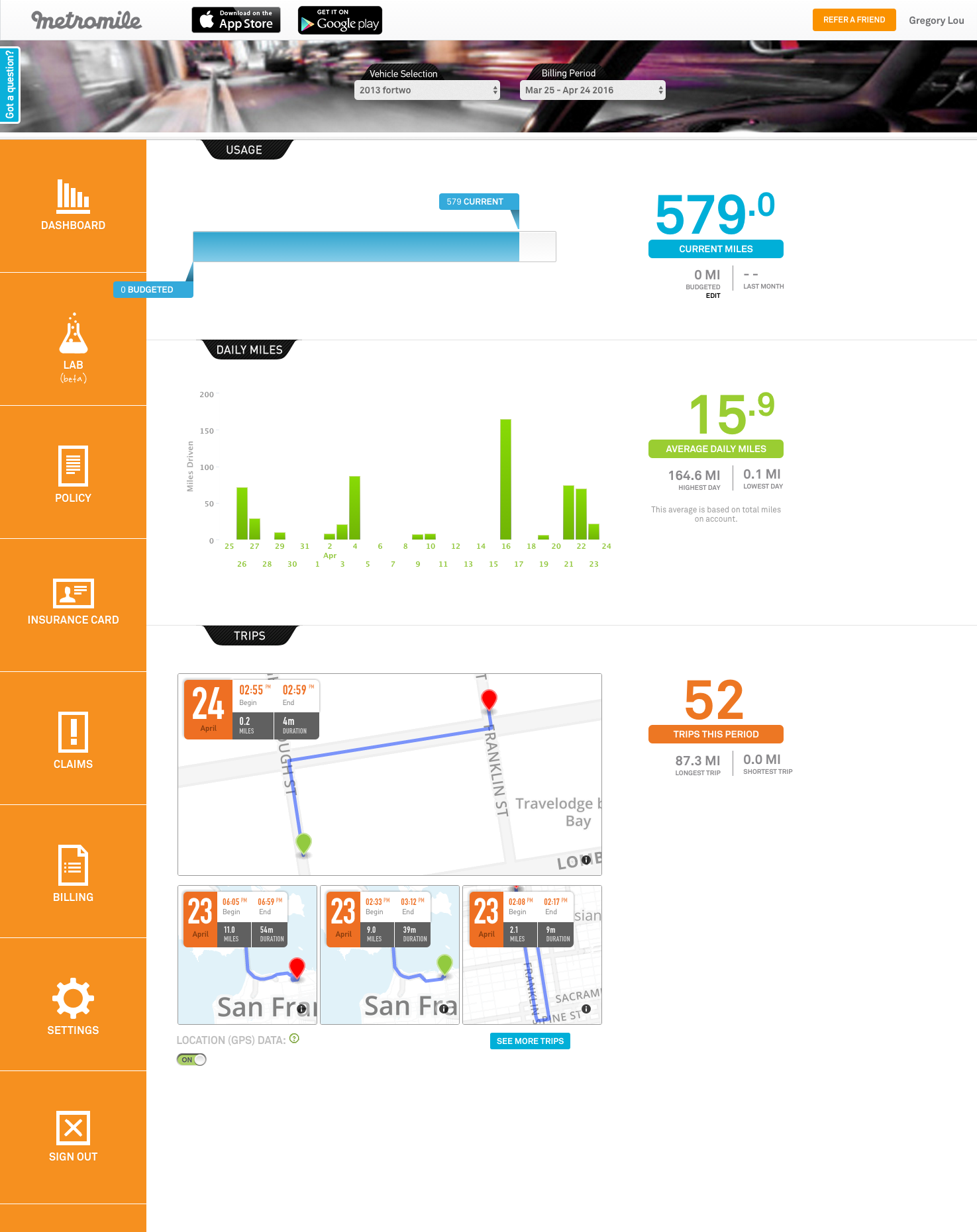
Old dashboard screenshots:


Process
Research > Sketch > Wireframe > Test > Iterate > Visual Design
I started by reviewing our analytics to see how customers were using the dashboard, and did a competitive and comparative analysis to explore dashboards and sleek account experiences. All the team members met together and created an affinity diagram to shape the MVP. Product, design, and engineering drew several rounds of divergent sketches, which I then created into wireframes to run in a user study.
Affinity diagram created by members of the design, product, engineering, and customer service teams.
Designers, product managers, and engineers sketched ideas based on the MVP product and voted on ideas.


I used the RITE testing method with 6 customers in person, and 22 online tests on usertesting.com. The in-person study also allowed users to build their ideal dashboard using paper prototypes of wireframe components. From the study, I learned that users liked having a personalized dashboard that offered important information at-a-glance rather than being able to perform all of the possible insurance tasks at their fingertips.
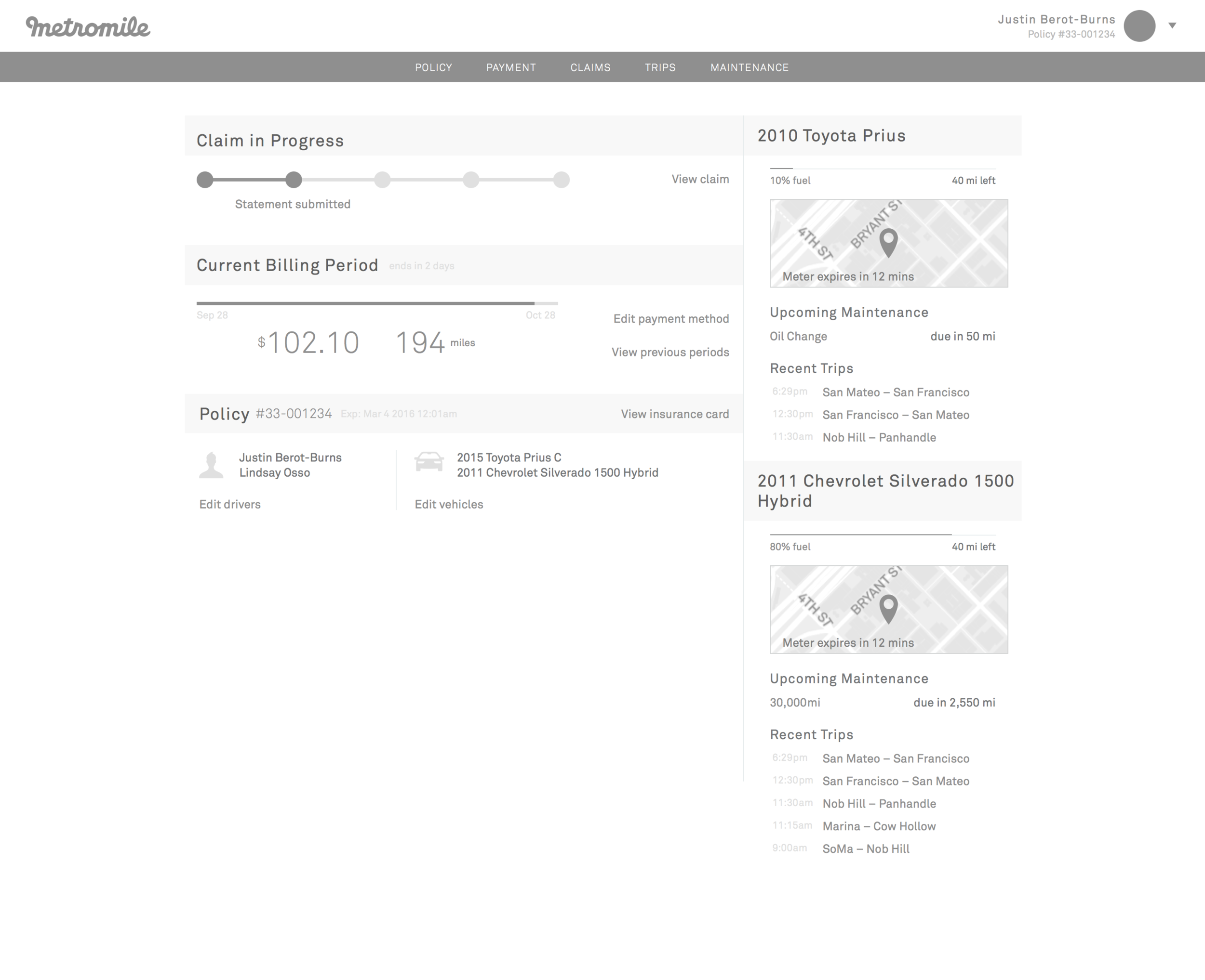
The 3 overview concepts that were tested:


From there, I turned the rest of the MVP into wireframes with input from the product manager, and created over 10 iterations of the visual design. Together with the design team, we narrowed it down to what the dashboard would look like today and fleshed out all the corner cases and various states (e.g., empty, loading, error).


